
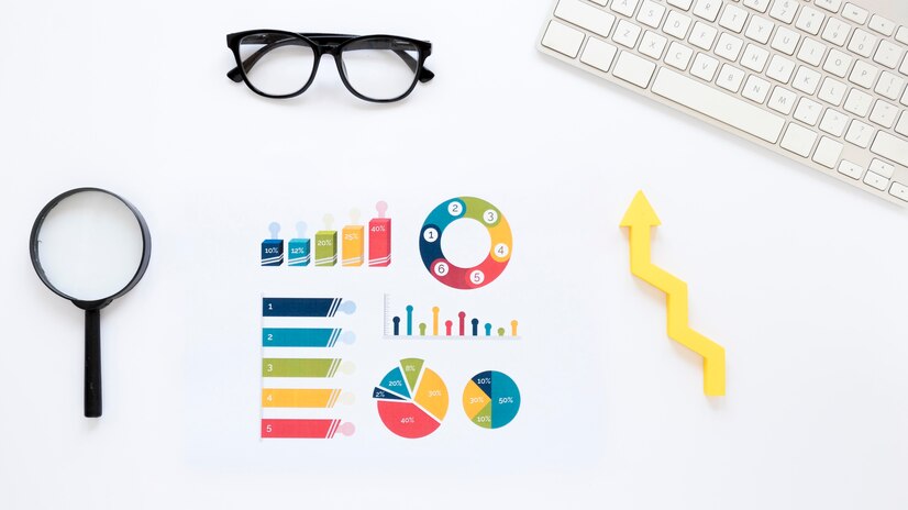
Data visualization is the graphical representation of information and data. It plays a crucial role in the world of data analysis and interpretation. By visually presenting complex data, it allows for easier understanding and decision-making.
Understanding the goals and advantages of data visualization is essential. It helps in identifying patterns, trends, and correlations that might otherwise go unnoticed. Data visualization is widely used in various fields such as business, healthcare, finance, and more.
First of all it is necessary to know your audience: understand who will be viewing your visualizations and tailor them to suit their preferences and level of expertise.
When creating visualizations, it’s important to keep them simple and clear. Choosing the right type of charts or graphs based on the data is crucial. Additionally, using appropriate color schemes and fonts can enhance the overall effectiveness of the visualizations.
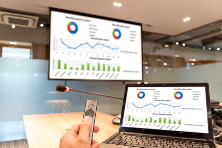
Utilizing dashboards and interactive elements can make the visualizations more engaging and user-friendly. Moreover, ensuring adaptive design for different devices enables a wider audience to access and interpret the visualized data.
Selecting the right tools for data visualization is crucial for achieving the desired outcome. Adhering to the principles of minimalism helps in avoiding cluttered and confusing visuals. It’s also important to test the visualizations for adequacy and clarity before finalizing them.
Moreover, it is preferably to provide context: include relevant context or annotations to help viewers interpret the data accurately and understand the significance of the visualized information.
There are numerous successful cases where data visualization has led to impactful insights and decisions. Analyzing these examples provides valuable lessons on how to effectively apply data visualization in different scenarios.
Netflix uses data visualization to analyze viewer preferences and content recommendations. Thanks to dashboards with user behavior data, the company optimizes content and enhances the user experience.
Airbnb applies data visualization to analyze housing demand in different cities and determine optimal prices. Using graphs and diagrams, the company makes strategic decisions for platform development and service improvement.
Amazon utilizes data visualization for inventory management, demand forecasting, and logistics optimization. Visualization systems help the company efficiently manage warehouse stocks and ensure fast delivery of orders.
Google actively employs data visualization for analyzing search queries, monitoring traffic, and evaluating advertising effectiveness.With dashboards and data-based reports, the company optimizes its products and services.
In conclusion, mastering the art of data visualization is essential in today’s data-driven world. By embracing the tips and best practices discussed, individuals and organizations can harness the power of data visualization to gain valuable insights and make informed decisions. Let’s continue to explore and leverage the art of data visualization for a better understanding of the world around us.
