
So you’re looking to visualize your data and you’re considering different programs to help you do that? Let’s break down the pros and cons of some popular options and see which one might be the best fit for you.
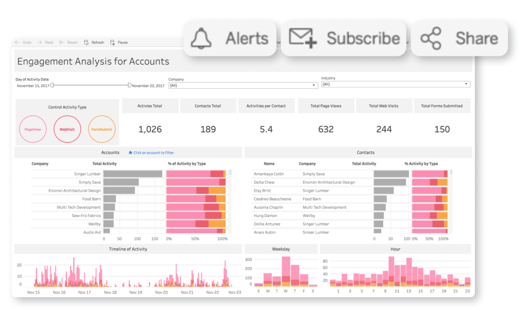
First up, we’ve got Tableau. One big advantage of Tableau is its user-friendly interface. It’s pretty easy to drag and drop your data and create visually appealing charts and graphs. Plus, it’s got some powerful analytics tools built in. On the downside, Tableau can get pretty pricey, especially for larger organizations. But if you’re looking for a straightforward and powerful data visualization tool, Tableau might be the way to go.
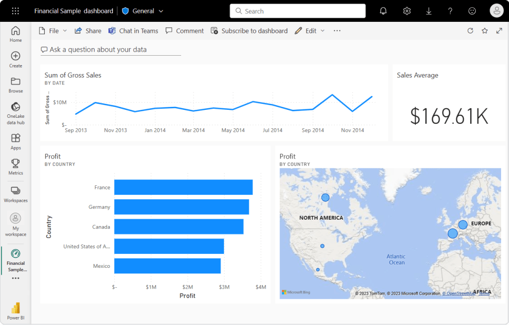
Next, let’s talk about Microsoft Power BI. One of the great things about Power BI is its seamless integration with other Microsoft products. If you’re already using Excel or Azure, Power BI will fit right in. It’s also got some impressive AI capabilities for analyzing your data. On the flip side, some users have found it to have a bit of a learning curve, especially if you’re not already familiar with Microsoft’s ecosystem.
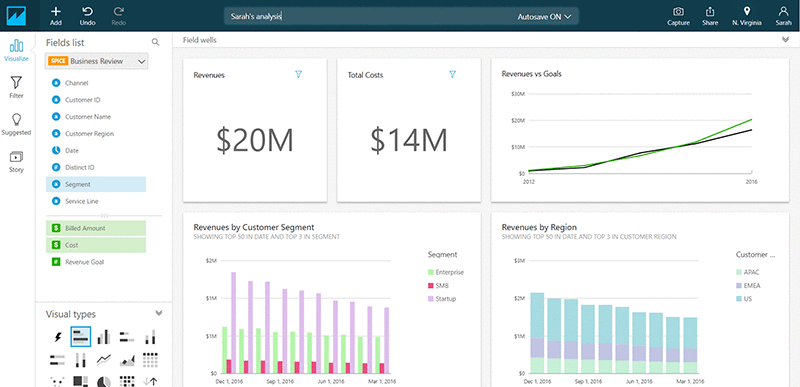
Moving on to QlikView/Qlik Sense. These tools are known for their powerful data manipulation capabilities. They can handle large and complex datasets with ease. However, they may not be as intuitive for beginners, and the licensing costs can add up quickly. If you’re a data pro looking for a robust solution, QlikView/Qlik Sense might be worth considering.

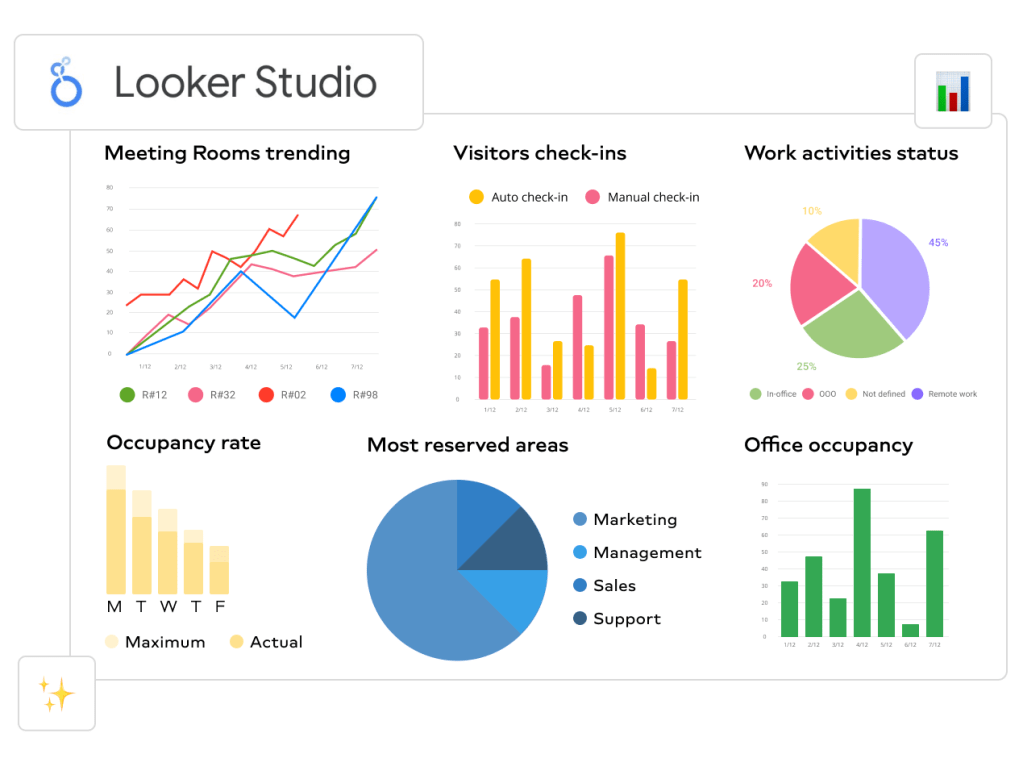
Now, let’s take a look at Google Data Studio (Looker Studio). The big selling point here is that it’s free! And if you’re already using other Google products, like Analytics or Ads, it’s a no-brainer to integrate them with Data Studio. On the downside, it may not have all the advanced features that some of the other tools offer. But if you’re just getting started with data visualization and want something simple and cost-effective, Google Data Studio could be a great choice.
Amazon QuickSight is a cloud-based data visualization service provided by Amazon Web Services. Its advantages include ease of use, integration with various data sources, the ability to create interactive visualizations, and flexible dashboard customization options. Disadvantages may include limited capabilities compared to other tools and difficulties when working with certain types of data. Features of use include an intuitive interface, quick report creation, and ease of working with data from various sources.
Overall, Amazon QuickSight is a powerful tool for data visualization in the cloud, which can be particularly beneficial for users utilizing other AWS services and seeking a quick and convenient solution for data analysis and visualization.
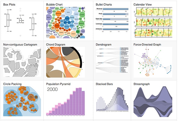
Lastly, we’ve got D3.js. This one is a bit different from the others because it’s a JavaScript library rather than a standalone program. D3.js gives you incredible flexibility and control over your visualizations. You can create some truly unique and interactive displays. However, it does require some coding knowledge, so it’s not the best option for everyone.
In conclusion, each of these programs has its own strengths and weaknesses. If you’re looking for something user-friendly and powerful, Tableau might be your best bet. If you’re already in the Microsoft ecosystem and want seamless integration, Power BI could be the way to go. For handling complex datasets, QlikView/Qlik Sense might be worth the investment. If you’re on a budget and want something simple, Google Data Studio is a solid choice. And if you’re a coding whiz who wants total control over your visualizations, D3.js could be the perfect fit.
Ultimately, the best program for you will depend on your specific needs and skillset. It might be worth trying out a few different options to see which one feels like the best fit for you. Happy visualizing!
